2022 - New Year, New Look
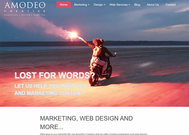
How many of us embark upon a new year looking to make a new start, revise our goals and ambitions or do things a little differently? Well, we have jumped on to that particular bandwagon by introducing a new look and a new website!
Like many businesses there comes a time when you have to look at what you are doing and think hard about how you present your products or services to the world. Our origins were very much in web design but we have come so far and do so much more than create websites that it was time to change the way we present ourselves.

We hope that we are still recognisable to our many existing marketing and website customers, our logo is still recognisable but it now encapsulates everything that we offer. We hope that it clarifies our activities and if you have feedback then please let us know.
In search of inspiration
Finding inspiration for a new look can require some soul searching and cause you to re-examine everything. When it came to our new website we considered everything from 2D cartoon like concepts to very abstract, visual and artistic concepts. We spent hours taking a look at what our competitors are doing and how they represent themselves. In the end we decided that we wanted to include a video concept because videos offer movement and excitement and ultimately because we wanted to present something aspirational and interesting that we think reflects our work and values. The idea of light, flares and torches seemed interesting to us with the notion that we always try to illuminate an audience or light up a pathway for our clients. The result is the two short videos involving torch or flare carriers. We hope that you have noticed their impact!
Using the menu headings to re-enforce what we do
While researching a huge number of websites I noticed that some of the most effective websites communicated what they did by using the menu system to re-emphasise their services. Often menus are busy and key services can be hidden beneath a generic "Services" menu. We determined that the menu would immediately reflect our key areas of Marketing, Design and Websites, even if at the expense of other options where we might need to find a different route to showing them.
Questions questions questions...
I'm a great believer in questions. They are a powerful device. The poet David Whyte wrote that “The marvelous thing about a good question is that it shapes our identity as much by the asking as it does by the answering.”.
We wanted to pose some questions to business owners that resonated with some of their business problems, questions to which we offer solutions. These questions rotate across our website's main hero section. I don't think you can miss them (unless you are viewing the website on a mobile phone in which case we omitted them to avoid cluttering the smaller real estate of those devices)!
Review, Refine, Move forwards
After an initial phase of content writing this was all put together, reviewed and in some cases thrown out or revised. There is no shame in this, it's a normal part of the process where messages, communication styles and nuances are put into a melting pot and simmered until a satisfactory recipe emerges. It is also important to maintain momentum as this tends to lead to successful outcomes more quickly and without the frustration of having to run with something again after you have forgotten half the reasons that you started in the first place.
Completion?
We consider that our new website is an evolving platform. We expect it to change, we expect to update the content regularly. The new look has largely been established but it is still subject to review and re-evaluation. A successful website needs constant attention which we would advocate of course! Look after your website and it will look after you :-)


